Categories: Archive

A 2013-2014 season’s greetings digital postcard for the contemporary art Pinault Foundation at Palazzo Grassi and Punta della Dogana (Venice).
Designed by Leonardo Sonnoli with Irene Bacchi and Simone Bastianelli at the Tassinari/Vetta studio.

Tags:
Categories: Archive

In the Fall-Winter 2013 period, the Pinault Foundation organizes several activities in its venues in Venice: Palazzo Grassi, Punta della Dogana and the Teatrino.
From interviews with artist to projections of art movies, from children workshops to literature readings.
For the communication of these events, Leonardo Sonnoli (Tassinari/Vetta) designed flyers and little posters, as well as the digital tools.

Tags:
Categories: Archive

“Guido Guidi. Cinque paesaggi 1983-1993” (Guido Guidi. Five landscape 1983-1993) is the title of the recent anthological book by Guido Guidi. The curators Antonello Frongia and Laura Moro selected 80 photos as examples of the Guidi’s research to explore a landscape that he likes to define “random and commonplace”.
Leonardo Sonnoli designed the book for the Central Institute for Cataloguing and Documentation (ICCD) of the italian Ministry of Cultural Heritage and Activities.

Tags:
Categories: Archive

Modus Operandi is the magazine by the “Riviera di Rimini Convention Bureau”. Each issue introduces an event organized by CBRR through video interviews, photogalleries, datas.
This digital version, designed with responsive technology (it let the text and images adapting their size in relation to the device), has been designed by Leonardo Sonnoli with Irene Bacchi (Tassinari/Vetta) for the Relè agency.

Tags:
Categories: Archive

More than 50.000 people visited from the 8th to the 10th of November in Turin the International Fair of Contemporary Art “Artissima” -directed by Sarah Cosulich Canarutto- and the exhibition project “One Torino” (until 12 January 2014).
Leonardo Sonnoli with Irene Bacchi, Igor Bevilacqua and Anny Comello at Tassinari/Vetta studio designed the identity, the catalogues and the signage of the fair and the exhibition.

Tags:
Categories: Archive

On the 8th of November 2013, Christine Macel, Contemporary Art Chief Curator at the Centre Pompidou, and Hans-Ulrich Obrist, art critic and historian, held a lecture in occasion of the conferences cycle “Walkie Talkies” organized by Artissima -Fair of Contemporary Art- on preserving living art in the museums.
Leonardo Sonnoli designed the poster in collaboration with Hans-Ulrich Obrist.

Tags:
Categories: Archive

One Torino is the first edition of an exhibition produced by Artissima and realized in collaboration with, and hosted by, the contemporary art museums and foundations in the city of Torino, from the 7th of November to the 12th of January 2014.
It reflects the different points of view by seven different curators. This multiple view is visually translated by an often changing geometric solid: it’s based on the ceiling of the Teatro Regio in Torino designed by the architect Carlo Mollino.
At the Tassinari/Vetta office, Leonardo Sonnoli with Irene Bacchi, Igor Bevilacqua and Anny Comello –with the collaboration of Daria Andreetta and Fabio Furlanis– design the communication and the catalogue.

Tags:
Categories: Archive

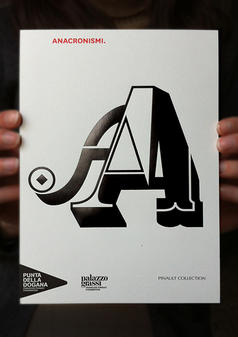
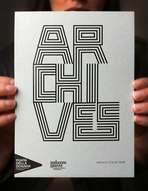
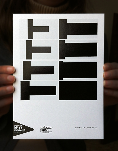
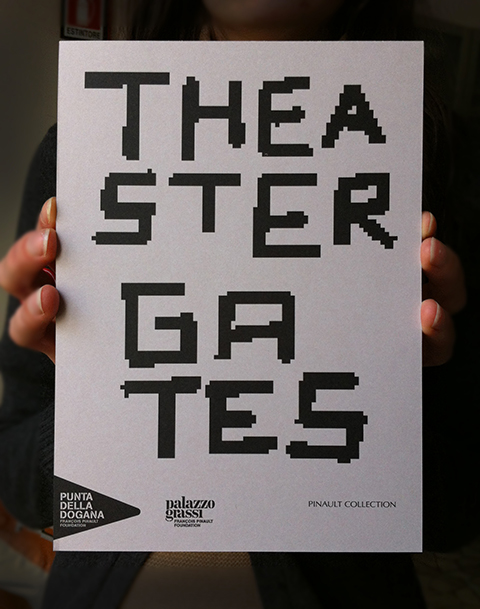
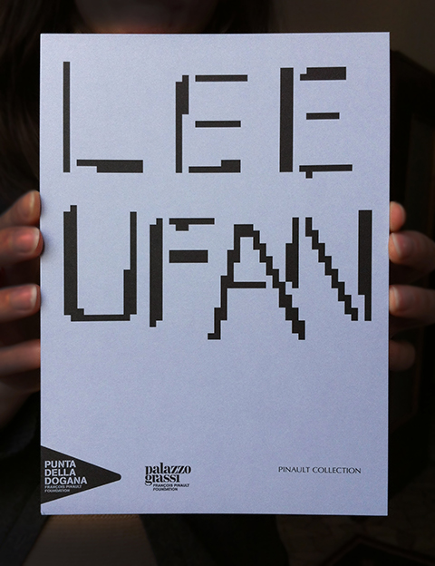
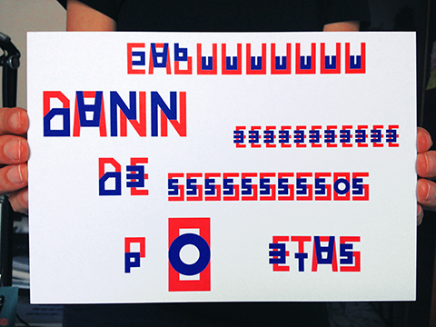
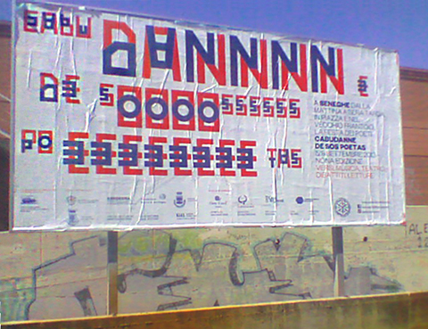
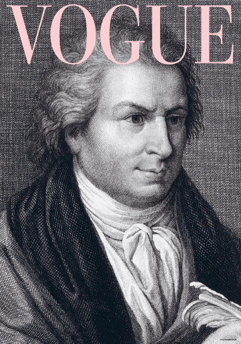
From 9 to 13 October 2013, in occasion of the ATypI conference in Amsterdam, it has been organized the poster exhibition “Compulsive Bodoni and the Parmigiano Typosytem”, curated by Riccardo Olocco, Jonathan Pierini. To celebrate the anniversary of Giambattista Bodoni (1740-1813) the two italian type designers invited several designers to think a poster using their typeface system called “Parmigiano”.
The poster by Leonardo Sonnoli remind the elegance and the always fashionable presence of the Bodonian typefaces through the time.
The exhibition is located at the Museum Café, UvA Library Amsterdam, Special Collections.

Tags:
Categories: Archive

From the 6th to the 8th of September 2013, in Seneghe -Sardinia, the beautiful italian island- there is the “Cabudanne de sos poetas” a poetry festival crossing the fields of music and theatre.
Leonardo Sonnoli designed the identity through an alphabet interpreting the reverberation of the voice sound with double glyphs for each letter. All stuff designed -from postcard to hooded sweaters- have another phonetic interpretation of the festival name.
It’s not only an homage to the futurist and dada phonetic poetry but also to the old sardinian tradition of poets acting in a sort of “free style” in public, without a written poem.
Sonnoli has been invited as speaker: his presentation -titled “How to steal from poets” about how visual and phonetic poetry influence visual communication.

Tags:
Categories: Archive

The communication for the 2013 edition of the Sagra Musicale Malatestiana -from August to September in Rimini- is designed by Leonardo Sonnoli and Irene Bacchi (Tassinari-Vetta) for the Relè agency.
The series of five classic music concerts correspond at five posters and other ephemera where few black and white shapes, coming from the avantgarde music notations, are the visual leitmotif.

Tags: