For the exhibition “Dear daddy-long-legs” at the Gambalunga Public Library in Rimini, Leonardo Sonnoli designed three posters (50×70 cm- two colors, offset printed in a limited edition) tribute to that site, the first city public library in Italy (1620).
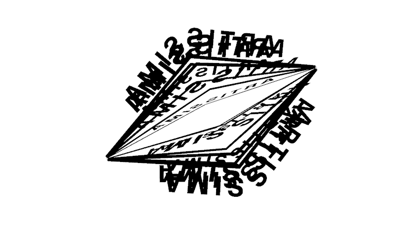
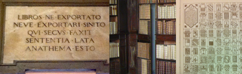
1. Anathema
The translation in italian of the latin epigraph standing in the first room: “LIBROS.NE.EXPORTATO.NEVE.EXPORTARI.SINITO.QUI.SECUS.FAXIT.SENTENTIA.LATA.ANATHEMA.ESTO”
“You will not take away the books and will let it not be taken away: If someone will do it will be excommunicated”
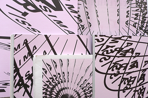
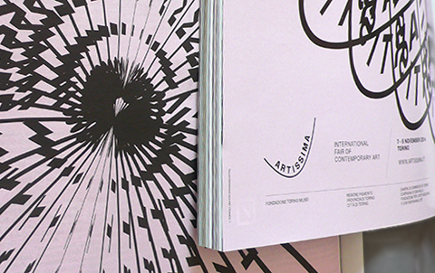
2. Little library (to furnish)
Inspired by a fake part of the original bookshelves, a door in books shape, the poster contains a series of Sonnoli’s reference books and is intended to hang in a room without a bookshelf. The frame is a part of the poster.
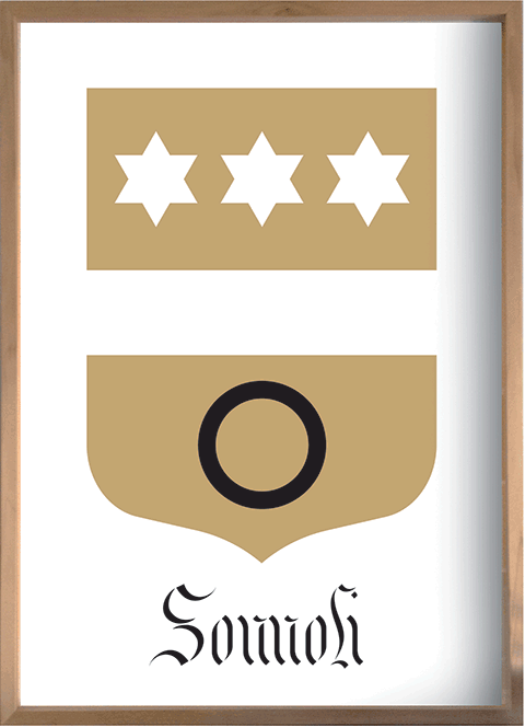
3. New family of Rimini. From the Gramignani’s apocryphal versionon, 1770.
Discovered in the Rimini Library, the Atlas of Rimini by Onofrio Gramignani, published in the 1770, show the topography of the city but also the list of the family of Rimini through beautiful pages filled by their heraldic coat of arms. Ideally, Sonnoli added his family crest, redesigned by the one found in a church in Tuscany.
Tags: