In everyday life the available time is always too long or too short.
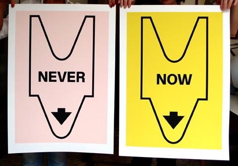
“NEVER” and “NOW” are two 50 x 70 cm posters designed by Leonardo Sonnoli with Irene Bacchi, silkscreen printed in a limited edition of 65 copies each.
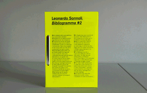
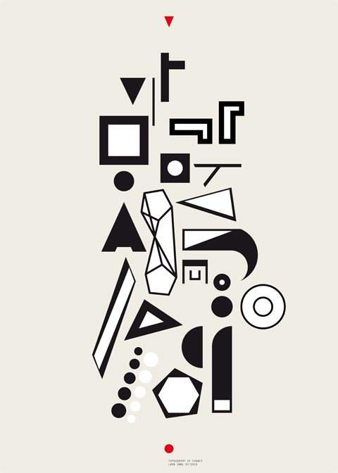
On September 2004 Leonardo Sonnoli has been published an octavo titled “Bibliogramma” with a selection of books, points of reference for his education (see references on the site).
After six years from that list, he, together with Irene Bacchi, reproduce as xerox copy, in actual size, few pages of a new series of 21 books, 5 of them presented yet in the previous selection.
This “Bibliogramma” number 2 is a personal notebook, without comments. The titles are just introduced by a definition: few of these ideas in form of books help to look at not banal ways to translate thoughts visually.
The “home made” printing run of only fourteen copies testify the ephemeral and personal nature of these “hit parades”, compiled to be told by voice together with the authors’ works, consequences of these readings.
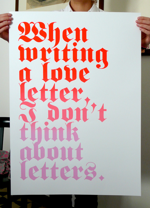
What do we think when writing a love letter?
How can we express verbally our passions?
In this case, typography can’t help us.
“When writing a love letter, I don’t think about letters.”
is a 50.5 x 72 cm poster designed by Leonardo Sonnoli
silkscreen, printed in a limited edition of 80 copies.
At the 14th edition of the literature festival (Festivaletteratura) in Mantua, Friday 10th of September at the Teatro Bibiena, 11 am, Stefano Salis -Il Sole24ore- interviews Leonardo Sonnoli about few books of his library points of reference for many works.
Avantgarde poetry books, music notation, novels or magazines, collected during the years, represent the straight suggestion for the consequent design of posters, books and communication projects.
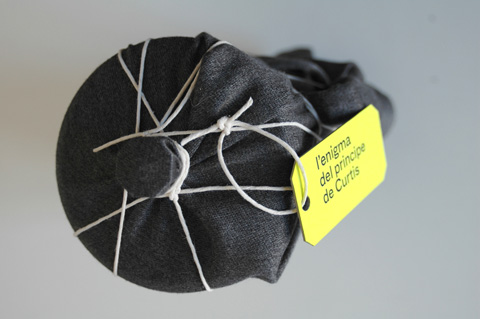
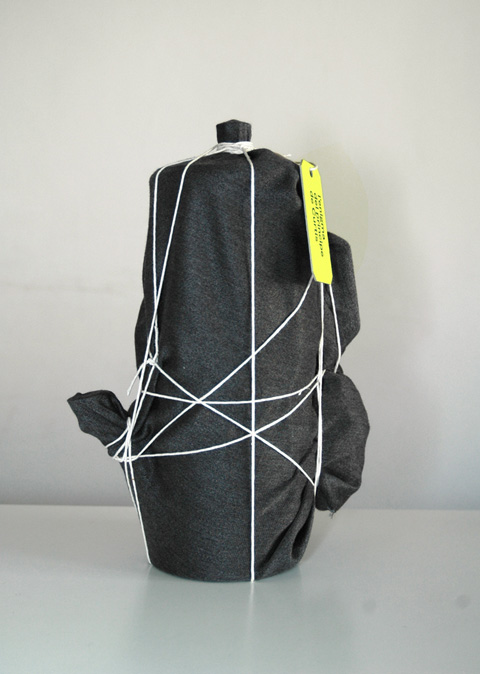
24 June to 17 October, 2010, an exhibition on the Prince Antonio de Curtis (better known as Totò, 1898-1967), one of the most famous Italian comic actor, will be held at the Valentin-Karlstadt-Musäum (Munich, Germany).
Among 29 artists, invited to present a tribute to the popular actor, Leonardo Sonnoli, together with Irene Bacchi, present a work concerning Antonio de Curtis surrealistic way to play with the Italian language, merging it with dialects and foreigner languages. He played on words creating absurd puns which fascinated high and popular audience and which are still really appreciated.
This homage to Antonio de Curtis is titled “L’enigma del principe de Curtis” (The enigma of the Prince de Curtis): a mysterious hidden object will never reveal it, becoming a link between two surrealistic authors: the popular Totò and the intellectual Man Ray.
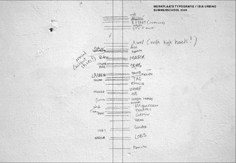
For the second consecutive year, Werkplaats Typografie (ArtEZ), Arnhem,
The Netherlands and ISIA Urbino, Italy, set up together, a two-week
Summerschool in Urbino, Italy, from the 19th of July to the 30th of July 2010.
Each day during the two weeks you will be guided by graphic designers Karel Martens, Armand Mevis (Werkplaats Typografie) and Leonardo Sonnoli (ISIA Urbino),
who will share their experiences with you.
Together they set up a project that relates to the typical setting of the school.
Maureen Mooren will visit as an external critic.
Application deadline 28th may
“Erotipo”, the erotic side of the typography, has been the theme of the last course held at the Iuav University in Venice by Leonardo Sonnoli.
The course started from a research, by Sonnoli and Irene Bacchi, on the relationship between the types -and the typography- and the human body therefore, as consequence, with the erotism.
The lecture, starting the course, introduced from the early examples of the renaissance period, the Geofroy Tory’s Champ Fleury, till the Anthon Beeke’s naked Alphabet, the homosexual magazines like Little Cesar and Butt, the vernacular and designed tart cards, the literature example with Histoire d’O and The Scarlet Letter, few contemporary type design examples like Fuse and other curiosity.
The students of the master class developed the theme in different ways with different medias.
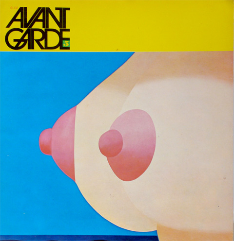
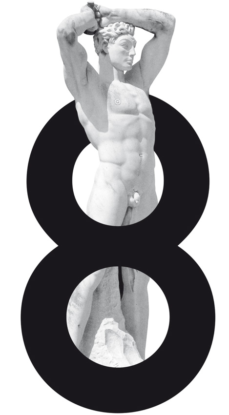
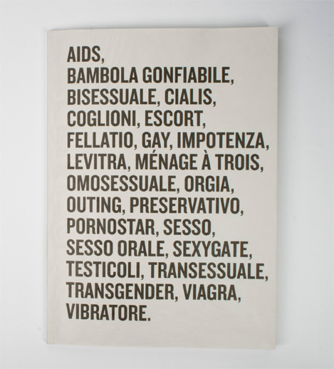
Above few examples, from top: Herb Lubalin’s Avant Garde cover with an illustration by Tom Wesselman; the 8th issue of the weekly pubblication FF X-TRA by Leonardo Sonnoli; students work by Diego Bilibio and Sara Murrone, the cover of a research about bad words on the newspaper and a video by Andrea Farinati, Giovanni Profeta, Isabella Zegna, inspired by the Truffaut’s movie “L’homme qui amait les femmes”.
At the PrinTEMPS de la typo, on 15th and 16th of April, Institut National du Patrimoine in Paris. Organized by L’Ecole Estienne.
The theme is the teaching of typography. Among the speakers: Pierre Di Sciullo, Andree Baldinger, Toan Vu Huu, Matthias Hillner and Peter Bilak.
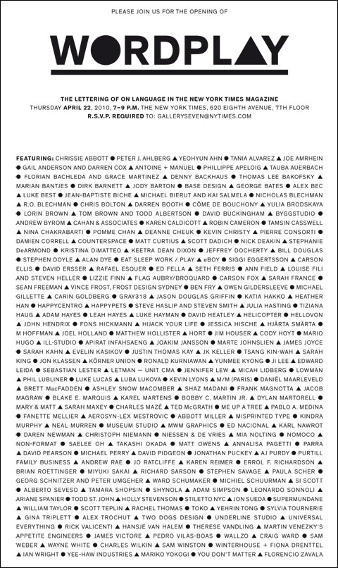
On Thursday, April 22, 2010, 7-9 P.M., at The New York Times, 620 Eighth Avenue, New York, opening of the exhibition WORDPLAY The Lettering of ON LANGUAGE in the New York Times Magazine.
Featuring the work of over 200 contemporary designers, illustrators, artists and typographers.
Among the several authors, Leonardo Sonnoli.