L’uomo che amava le donne from leonardo sonnoli on Vimeo.
“Erotipo”, the erotic side of the typography, has been the theme of the last course held at the Iuav University in Venice by Leonardo Sonnoli.
The course started from a research, by Sonnoli and Irene Bacchi, on the relationship between the types -and the typography- and the human body therefore, as consequence, with the erotism.
The lecture, starting the course, introduced from the early examples of the renaissance period, the Geofroy Tory’s Champ Fleury, till the Anthon Beeke’s naked Alphabet, the homosexual magazines like Little Cesar and Butt, the vernacular and designed tart cards, the literature example with Histoire d’O and The Scarlet Letter, few contemporary type design examples like Fuse and other curiosity.
The students of the master class developed the theme in different ways with different medias.
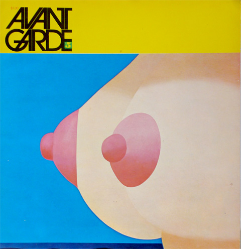
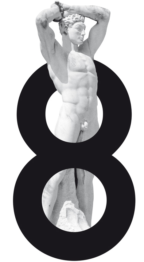
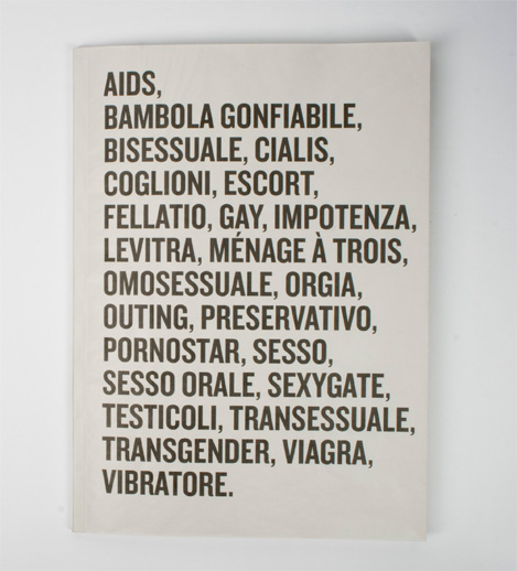
Above few examples, from top: Herb Lubalin’s Avant Garde cover with an illustration by Tom Wesselman; the 8th issue of the weekly pubblication FF X-TRA by Leonardo Sonnoli; students work by Diego Bilibio and Sara Murrone, the cover of a research about bad words on the newspaper and a video by Andrea Farinati, Giovanni Profeta, Isabella Zegna, inspired by the Truffaut’s movie “L’homme qui amait les femmes”.